Brand Guideline
How to present S Technologies — the mark, the colours, the type, and the name.
These are the assets and rules we use ourselves. Follow them when you write about S Technologies, embed our mark, or build something that sits alongside our products.
At a glance
The details most often needed. Every value copies to the clipboard.
- Name
- Domain form
- Bengali name
- Founded
- Based in
- Website
One-line descriptor
S Technologies (STechBD.Net) is a research-based technology company in Bangladesh, founded in 2013, providing domain registration, hosting, software and AI development, design, and SEO.
The mark
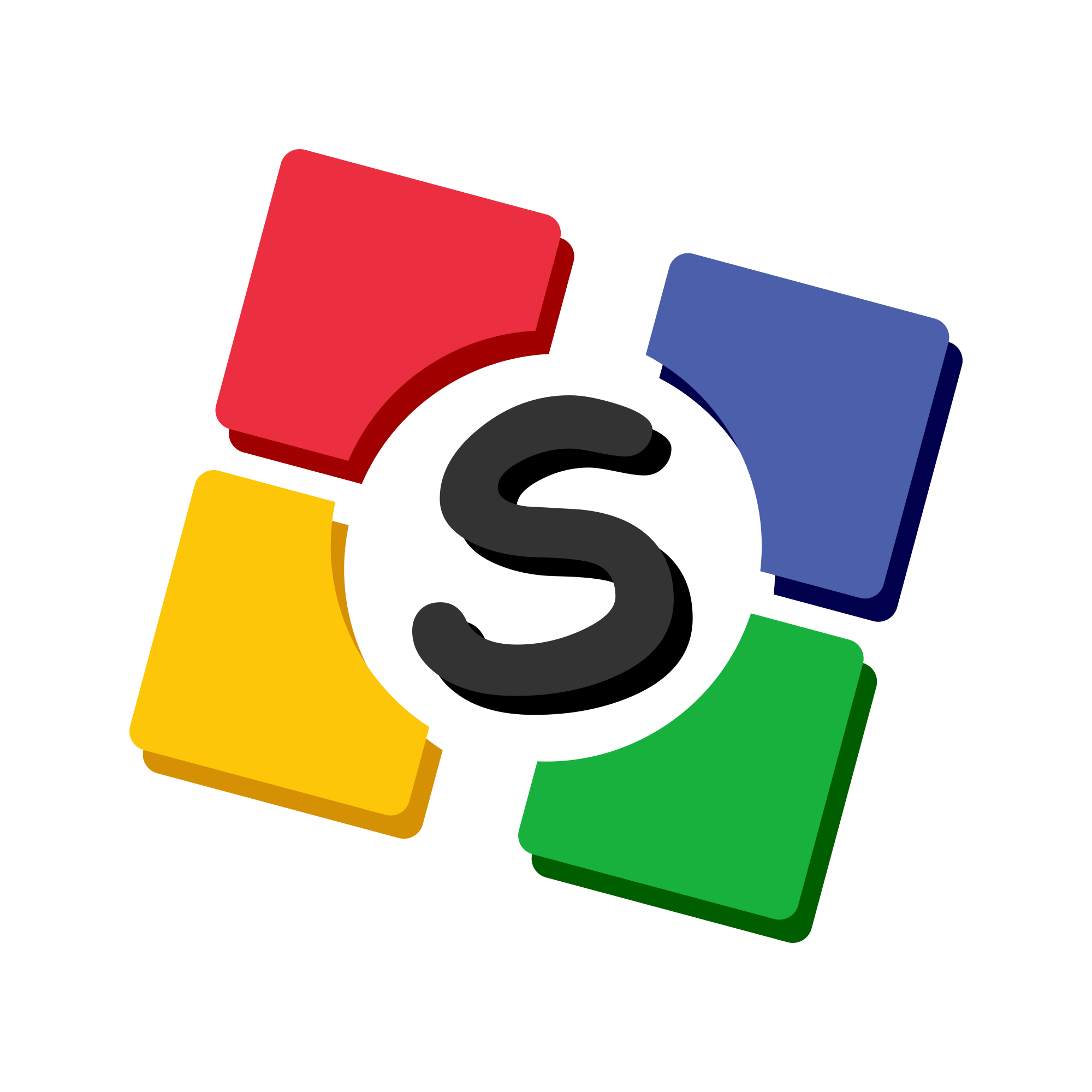
The S Technologies mark is four coloured tiles around a central S. It comes in an animated form used across the site and a flat SVG for anywhere animation is not appropriate.

Clear space and minimum size
Two measurements decide whether the mark reads. Both are drawn here rather than described, because a number in a sentence is easy to round down.
Clear space
Leave a margin of X on all four sides. No type, rule, edge, or other logo enters it. When the mark sits in a tight bar, shrink the mark rather than the margin.
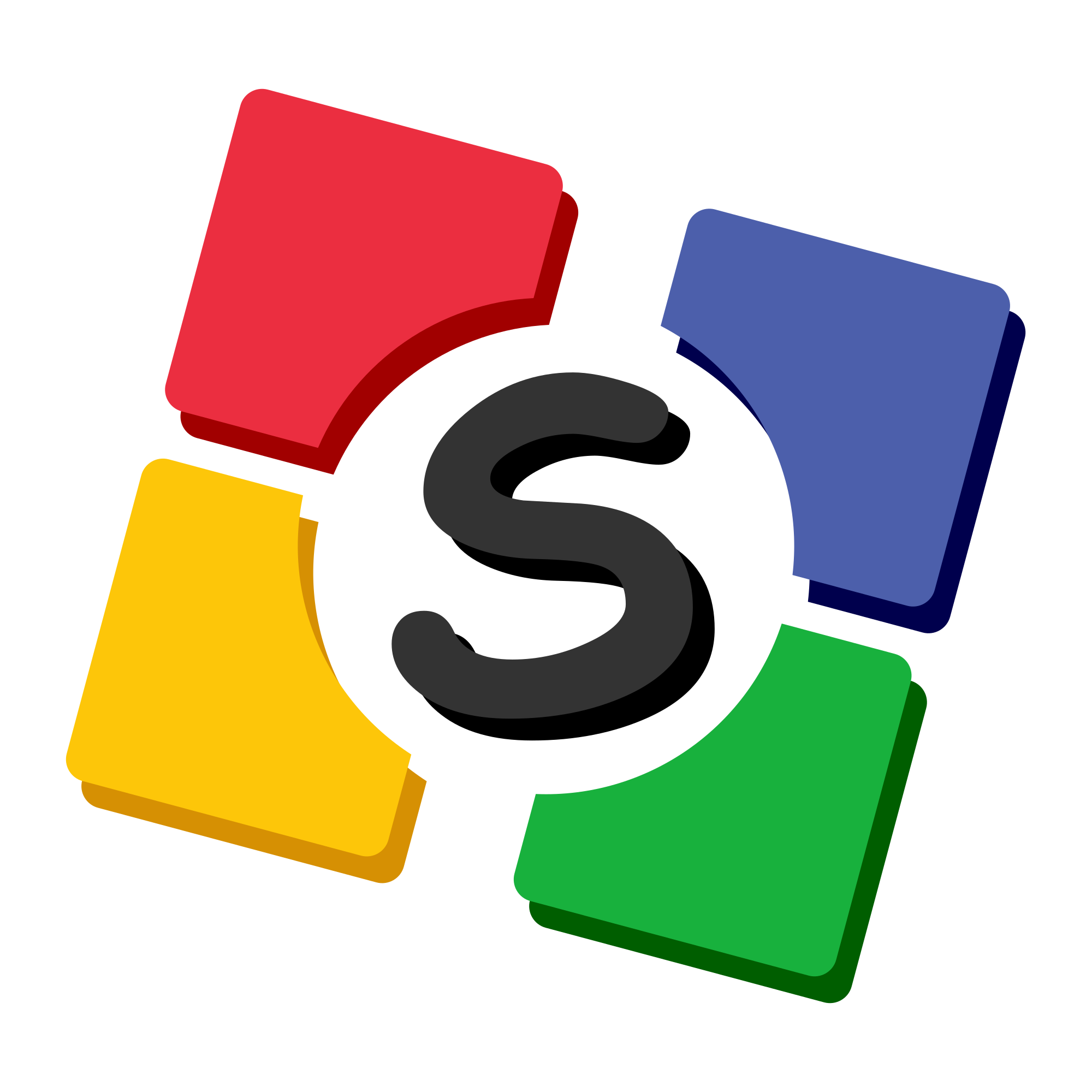
X = the height of the central S
Minimum size
Below 24px the four tiles merge into one shape and the S closes up. If the space is smaller than that, use a wordmark or the site name instead.
16px
Too small. The tiles merge and the S disappears.
The mark in place
Four surfaces cover almost everything. Pick the mark that keeps the tiles separated.
Light surface
The bare mark. This is the default.
Dark surface
The bare mark again — the tiles are bright enough to hold their own.
Accent surface
The white disc, so the tiles are not read as part of the accent.
Over imagery
The white disc, always. Never the bare mark on a photograph.
Logo colours
Five fills make up the mark, each with a darker shadow behind it. These are fixed — they are the only colours the mark is ever drawn in.
Green
Lower-right tile
Blue
Upper-right tile
Yellow
Lower-left tile
Red
Upper-left tile
Letter
The central S
Accent colours
The site ships a theme picker, so the interface accent is not fixed. Every pair below is a valid S Technologies accent, and the mark itself never changes with them.
Indigo
Default- Primary
- Secondary
Red
- Primary
- Secondary
Yellow
- Primary
- Secondary
Green
- Primary
- Secondary
Teal
- Primary
- Secondary
Blue
- Primary
- Secondary
Purple
- Primary
- Secondary
Rose
- Primary
- Secondary
Colour in code
The accent is two CSS variables, not a hex you copy. Read them and your work follows the theme picker; hard-code one and it stops at the first theme change.
:root {
	--primary: #4f46e5;
	--secondary: #4338ca;
}

.theme-green {
	--primary: #16a34a;
	--secondary: #15803d;
}

@theme inline {
	--color-primary: var(--primary);
	--color-secondary: var(--secondary);
}// Right — follows the theme picker.
<button className="bg-primary hover:bg-secondary" />
<div className="bg-linear-to-r from-primary to-secondary" />
<span className="bg-primary/10 text-primary" />
// Wrong — frozen at one theme.
<button className="bg-[#4f46e5] hover:bg-[#4338ca]" />Text on colour
The accent moves with the theme, so these are stated as pairs rather than ratios. Anything outside them needs checking against WCAG AA at the size you are setting it.
S Technologies
Research-based technology company.
White on primary
Buttons, solid bands, the mobile menu.
S Technologies
Research-based technology company.
White on secondary
The hover state of the above.
S Technologies
Research-based technology company.
Primary on white
Section headings and quiet links.
S Technologies
Research-based technology company.
Ink on white
Body copy. Never lighter than gray-700.
S Technologies
Research-based technology company.
Primary on secondary
Two accents, no separation.
S Technologies
Research-based technology company.
Grey on white
gray-400 fails AA at body size.
Typography
Two typefaces, one per language, both from Google Fonts. The scale below is what the shared components render, so matching it keeps anything you build consistent with the rest of the site.
Inter
Every English page, and product names anywhere.
S Technologies
Research-based technology, built in Dhaka.
400 · 600 · 700 · 800
Hind Siliguri
The whole /bn tree. Inter ships no Bengali glyphs.
এস টেকনোলজিস
গবেষণাভিত্তিক প্রযুক্তি প্রতিষ্ঠান, ঢাকা।
400 · 500 · 600 · 700
Page title
36 → 60px, extrabold, tight tracking
We provide solutions
Section heading
36 → 60px, bold, accent colour
What we value
Card heading
20px, bold
Research before product
Eyebrow
12px, semibold, uppercase, wide tracking
OVERVIEW
Body
16 → 18px, 1.8 line height
Body copy sits at a comfortable measure.
Long-form text is capped at 58ch — roughly 77 characters — to stay inside the readable range.
The name
Three forms are correct, and each has its place.
S Technologies
The primary name. Two words, capital S, capital T.
STechBD.Net
The domain form, used where the web address is the point.
এস টেকনোলজিস
The Bengali form, for Bengali-language contexts.
Never written as
- STech BD
- S-Technologies
- sTechnologies
- S TECHNOLOGIES in running text
Bengali and Latin together
Bengali copy keeps product names in Latin script. Transliterating them makes them unsearchable and, to a reader who knows the product, unrecognisable.
- Product, platform, and language names stay in Latin script: Next.js, WordPress, PHP, Python, Docker, Android, iOS, macOS, GitHub.
- Bengali case endings attach with a hyphen and are never fused into the name.
- The company name is the one deliberate exception: এস টেকনোলজিস is the site-wide Bengali form.
- Generic acronyms are words, not names, so they are written in Bengali: এআই, এসইও, ভিপিএস.
Next.js-এর নতুন সংস্করণ
নেক্সট.জেএস-এর নতুন সংস্করণ
Python-এ লেখা
পাইথনে লেখা
এস টেকনোলজিস-এর সেবা
S Technologies-এর সেবা
How we write
Plain, specific, and unhurried. We sell infrastructure people have to trust, and overstatement is the fastest way to lose that.
Plain
Short sentences and ordinary words. If a term needs a glossary, explain it once, in line.
Specific
A number, a limit, or a name — never "blazing fast" where "99.9% uptime" is meant.
Honest
We say what a plan does not include. A price that is on enquiry is written as on enquiry.
Unhurried
No countdowns, no manufactured scarcity, no exclamation marks in running copy.
Leverage our cutting-edge, world-class synergistic hosting solutions!
BDIX hosting on our own servers, with cPanel and daily backups.
Blazing fast delivery — guaranteed!!!
We agree a delivery date when the brief is signed off, and we tell you if it slips.
Contact us for the best price in the market.
Web app development starts at ৳30,000. Tell us the scope and we will quote it.
Interface elements
These are rendered by the same shared components the rest of the site uses, so what is drawn here is what you get. Compose from them rather than restyling.
Buttons
Primary for the main action, soft for a quiet one, white only over a gradient.
Badge and rule
The eyebrow above a section heading, and nothing else.
The accent gradient under a heading. It is decoration; it never separates content.
The divider between bands on a long page. This one is the page you are reading.
Card
Hover me
The surface lifts and takes the accent.
Static
For a card that is not a link.
- Composed, not restyled
- One surface everywhere
One translucent surface, lifting on hover. Every boxed block on the site is this.
Using the mark
Two short lists. Anything not covered here, ask us first.
- Leave clear space around the mark equal to the height of the central S.
- Keep the mark at 24px or larger so the four tiles stay legible.
- Place the mark on a plain background, or on a light surface over imagery.
- Use the flat SVG in print, email, and anywhere animation will not run.
- Do not recolour the tiles or apply a gradient over them.
- Do not stretch, skew, or rotate the mark.
- Do not add a drop shadow, outline, or bevel.
- Do not place the mark on a busy photograph without a backing surface.
- Do not rebuild the mark from the accent colours — those are interface colours, not logo colours.
The same rules, drawn
None of these are acceptable. Where a rule is not covered here, use the mark as it ships.
Stretched
The mark is square. Scale it; never fit it to a box.
Rotated
It sits level. There is no jaunty version.
Recoloured
The five fills are fixed and are not the accent.
Shadowed
No drop shadow, outline, bevel, or glow.
On a busy photo
Use the white-disc mark instead.
Boxed
Do not draw a frame or badge around it.
Download
The full set. Ask us before using anything that is not here.
| Asset | Format | Size | Use | |
|---|---|---|---|---|
| Mark | SVG | Vector | Light surfaces, print, any size. | Download |
| Mark on white | SVG | Vector | Dark surfaces and imagery. | Download |
| Raster mark | PNG | 192 × 192 | Where SVG will not render. | Download |
| App tile | PNG | 180 × 180 | iOS home screen. | Download |
| Large tile | PNG | 310 × 310 | Windows tiles. | Download |
| Favicon | PNG | 32 × 32 | Browser tabs. | Download |



Need something else?
For a format that is not here, permission to use the mark in a way these rules do not cover, or a press enquiry, get in touch and we will sort it out.